Tag: chart

The market can be bizzare sometimes
We were treated to a spectacular turn of events last night at the US Open Tennis.
By a coincidence, I have been carefully studying the way the market behaves before the off at the US Open this year. More or less it’s flat as a pancake, but there are subtle bits of information contained in the pre-off pricing. I’ve been more interested in how this changes over the rounds.
In the latter stages of the tournament as the amount pre-off …

Being contrary
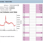
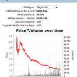
Have a look at the following chart from the 14:15 at Lingfield on Saturday. This is a very big steamer. Of course in hindsight you would say, ‘If I backed it at X and laid it at Y I would have made £Z’. Most people would look at this chart and back it high and lay it low. After all backing at 3 and laying at 2 would net you a 100% profit on your stake and fully greened up
…


Connect
Connect with us on the following social media platforms.